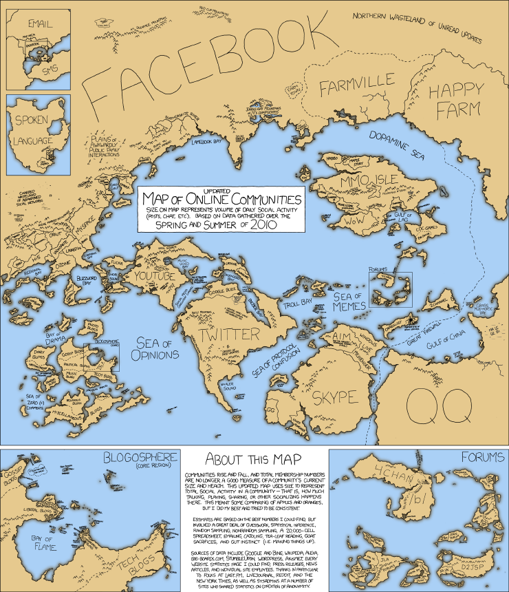
Communities rise and fall, and total membership numbers are no longer a good measure of a community’s current size and health. This updated map uses sizes to represent total social activity in a community – that is, how much talking, playing, sharing or other socializing happens there. This meant some comparing of apples and oranges, but I did my best and tried to be consistent.


Leave a Reply